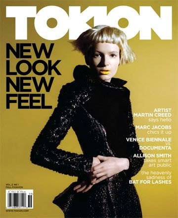
Just when I was finally getting over the
Another Magazine redesign, I spotted the new issue of
Tokion at the newsstand. It looked so generic that I could barely recognize it. Why would a magazine that is known for it’s playful, forward-thinking approach to editorial design decide to re-invent itself as a sub-par fashion magazine? And what is with the cover? It’s almost as bad as
Surface. Not interesting!


No comments:
Post a Comment